

Visualizing Running
I have been running a lot lately. It has become sort of a necessary part of my day that both brings me joy and allows me to set personal goals. Each day I may run a different length, at a different speed, and through varying elevations. In my journey to better my data visualization skills, I felt my running endeavor would be the perfect muse. With some help from my running app Strava, I was able to collect data from all sorts of aspects of my running. For this project, I wanted to come up with 3 different ways that I could represent my running journey in a clear visual way.

Hi! My name is Kristin Ardese and I am a professional Graphic Designer and Marketing Strategist. I hope that by sharing some of my expertise, I can help offer valuable insights and build an engaging community.
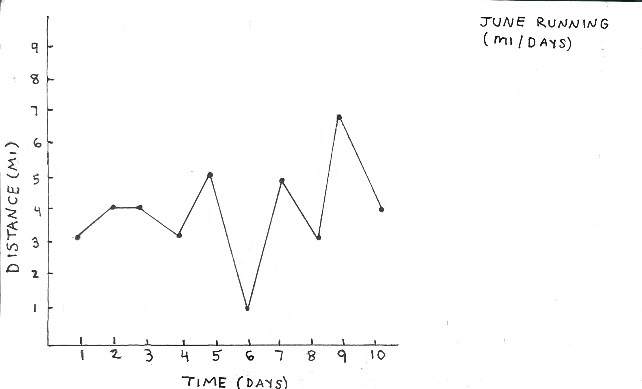
My first graph was simple. I wanted to see my mileage per day, over 10 days of running. As a result, this graph was a distance (mi) by time (days) graph. The process for this was quite easy, as each axis could be measured by units of 1. Every quarter inch tic mark on the x-axis was representative of a day. Each quarter inch tic mark on the y-axis represented another mile. With this, I could track my running mileage by plotting a point even with both the respective mileage tic (y-axis) and the respective day (x-axis). The results brought a clear visual of my running patterns. With every decrease in mileage, I usually increased the following day. This was helpful to see, as I know that I am participating in active recovery while keeping up my stamina.
Graph #2: A Pie Chart

Now that I had plotted on a graph, I wanted to try a different visual representation. For this, I thought a little bit out of the box and used more than just my Strava app for help. I wanted to see how my running steps compared to my daily steps out of my total daily movement. My Fitbit also helped with data collecting for this graph, as it tracked my total daily steps. By subtracting my running steps that were recorded on Strava, from my total steps in a day, I was able to find my non running steps. I did this for each day that I ran in the 10 day period. To find the average makeup that my running steps have over my day, I had to do a little bit more math. I first added all of my total daily steps up. Then I totaled all of my running steps together. To find the % makeup that my running steps had over my day, I divided my total running steps by my total steps and multiplied that answer by 100.

This came to 33.9%. The difference of that from 100 gave me 66.1% for non running steps. I decided that a pie chart was best for this representation of percentages. These results gave me a good idea of just how much my running steps take up my total daily activity.
Graph #3: An Area Chart
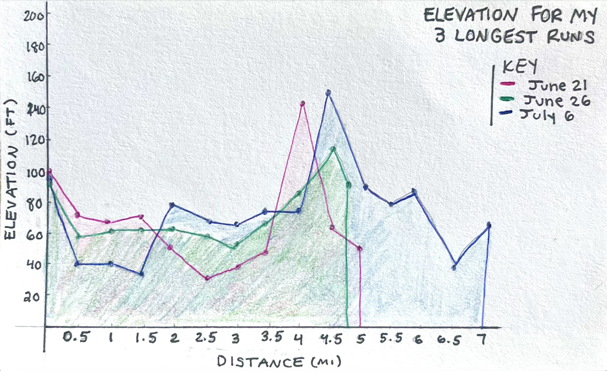
Getting back to plotting, I wanted to try making a graph that I had never made before. It came with some errors for sure, but I still think it is important to discuss my learning curve. I thought that tracking my elevation would be a fun and different way of viewing my runs. To prevent the graph from getting too busy, I decided on only plotting 3 of my longest runs because they would have the most varying elevation. Once again, Strava helped with tracking the elevation throughout my runs. After plotting and shading each run, I found that maybe an area chart was not the best choice for tracking my elevation. Although area charts are commonly used for elevation graphing, each section plotted is much higher than the one beneath it. This would show multiple levels rather than any data that merges. The example below best represents what I am describing:

From Datapine.com
lthough I could have used a bar chart or another line graph to plot my elevation, I am glad that I was able to try something new. Mistakes are the only way to learn and improve, and that was exactly the point of this exercise.
Final Comments
Data visualization is a powerful tool that can be used to gain valuable insights. By tracking and plotting various aspects of my running, I was able to learn about my active recovery, the amount of activity I do in a day, and how much the elevation of my routes change during a run. In addition, exploring different types of visualizations was great practice for making information more accessible and observational.